CSSで吹き出しを作る方法
吹き出し(下向き)
CSSで吹き出しを作り方は、文章を書くエリア(要素)に疑似クラス(before)で吹き出し部(三角形)を追加して形成します。下向きにしたい場合はborderプロパティを下記のように記述します。左右のborder-color(線カラー)を透明化させborder-width(線幅)で10px(上) 10px(右) 0(下) 10px(左)と、下の線幅を0にして下向きの三角を作ります。
CSSでの三角形の作り方については下記記事を参考にしてみてください。

<div class="bubble01">吹き出し(下向き)</div>.bubble01 {
position: relative;
display: inline-block;
width: 200px;
text-align: center;
color:#FFF;
padding: 25px;
background-color: #f39800;
border-radius: 5px;
}
.bubble01:before {
content: '';
position: absolute;
display: block;
z-index: 1;
border-style: solid;
border-color: #f39800 transparent;
border-width: 10px 10px 0 10px;
bottom: -10px;
left: 50%;
margin-left: -10px;
}吹き出し(上向き)
上向きの吹き出しは、左右のborder-color(線カラー)を透明化させborder-width(線幅)で0(上) 10px(右) 10px(下) 10px(左)と、上の線幅を0にして上向きの三角を作ります。
<div class="bubble02">吹き出し(上向き)</div>.bubble02 {
position: relative;
display: inline-block;
width: 200px;
text-align: center;
color:#FFF;
padding: 25px;
background-color: #f39800;
border-radius: 5px;
}
.bubble02:before {
content: '';
position: absolute;
display: block;
z-index: 1;
border-style: solid;
border-color: #f39800 transparent;
border-width: 0 10px 10px 10px;
top: -10px;
left: 50%;
margin-left: -10px;
}吹き出し(右向き)
右向きの吹き出しは、上下のborder-color(線カラー)を透明化させborder-width(線幅)で10px(上) 0(右) 10px(下) 10px(左)と、右の線幅を0にして右向きの三角を作ります。
<div class="bubble03">吹き出し(右向き)</div>.bubble03 {
position: relative;
display: inline-block;
width: 200px;
text-align: center;
color:#FFF;
padding: 25px;
background-color: #f39800;
border-radius: 5px;
}
.bubble03:before {
content: '';
position: absolute;
display: block;
z-index: 1;
border-style: solid;
border-color: transparent #f39800;
border-width: 10px 0 10px 10px;
top: 50%;
right: -10px;
margin-top: -10px;
}吹き出し(左向き)
左向きの吹き出しは、上下のborder-color(線カラー)を透明化させborder-width(線幅)で10px(上) 10px(右) 10px(下) 0(左)と、左の線幅を0にして左向きの三角を作ります。
<div class="bubble04">吹き出し(左向き)</div>.bubble04 {
position: relative;
display: inline-block;
width: 200px;
text-align: center;
color:#FFF;
padding: 25px;
background-color: #f39800;
border-radius: 5px;
}
.bubble04:before {
content: '';
position: absolute;
display: block;
z-index: 1;
border-style: solid;
border-color: transparent #f39800;
border-width: 10px 10px 10px 0;
top: 50%;
left: -10px;
margin-top: -10px;
}吹き出し部の形状を変える(其の1)
吹き出し部(三角形)を鋭角にしたい場合の例です。border-width(線幅)で20px(上) 10px(右) 0(下) 10px(左)と、上の線幅を20pxにサイズ変更してにして鋭角の三角を作ります。
<div class="bubble05">CSSでの吹き出し</div>.bubble05 {
position: relative;
display: inline-block;
width: 200px;
text-align: center;
color:#FFF;
padding: 25px;
background-color: #f39800;
border-radius: 5px;
}
.bubble05:before {
content: '';
position: absolute;
display: block;
z-index: 1;
border-style: solid;
border-color: #f39800 transparent;
border-width: 20px 10px 0 10px;
bottom: -20px;
left: 50%;
margin-left: -10px;
}吹き出し部の形状を変える(其の2)
吹き出し部(三角形)のバリエーション例です。border-width(線幅)で20px(上) 20px(右) 0(下) 0(左)とすることで角度が変わった三角を作ることができます。
<div class="bubble06">CSSでの吹き出し</div>.bubble06 {
position: relative;
display: inline-block;
width: 200px;
text-align: center;
color:#FFF;
padding: 25px;
background-color: #f39800;
border-radius: 5px;
}
.bubble06:before {
content: '';
position: absolute;
display: block;
z-index: 1;
border-style: solid;
border-color: #f39800 transparent;
border-width: 20px 20px 0 0;
bottom: -20px;
left: 50%;
margin-left: -10px;
}円形の吹き出し
円形の吹き出しを作る場合は、⑤で紹介した鋭角の三角形を使用した方がキレイな吹き出しを作れます。
<div class="bubble07">吹き出し</div>.bubble07 {
position: relative;
display: inline-block;
width: 100px;
height: 100px;
line-height: 100px;
text-align: center;
color:#FFF;
background-color: #f39800;
border-radius: 50%;
}
.bubble07:before {
content: '';
position: absolute;
display: block;
z-index: 1;
border-style: solid;
border-color: #f39800 transparent;
border-width: 30px 10px 0 10px;
bottom: -28px;
left: 50%;
margin-left: -10px;
}枠線の吹き出し
枠線の吹き出しは吹き出し部(三角形)の疑似クラス(before・after)を用い作成します。beforeとafterをz-index(深度)で重ね合わせafter(下層)の表示位置を調整し枠線を作ります。
<div class="bubble08">CSSでの吹き出し</div>.bubble08 {
position: relative;
display: inline-block;
width: 200px;
text-align: center;
padding: 25px;
background-color: #FFF;
border: #000 solid 4px;
}
.bubble08:before {
content: '';
position: absolute;
display: block;
z-index: 1;
border-style: solid;
border-color: #FFF transparent;
border-width: 25px 25px 0 0;
bottom: -16px;
left: 50%;
margin-left: -10px;
}
.bubble08:after {
content: '';
position: absolute;
display: block;
z-index: 0;
border-style: solid;
border-color: #000 transparent;
border-width: 25px 25px 0 0;
bottom: -25px;
left: 50%;
margin-left: -14px;
}簡単に吹き出しを作れるジェネレーター
これまでCSSでの吹き出しに作り方を解説しましたが、CSSなんて理解しなくてもいいから手軽にソースだけ欲しいという方もいるでしょう。そんな方はブラウザでCSSの吹き出しを作ることができるジェネレーターを利用してみましょう。簡単な操作で吹き出しを作成できるジェネレーターを4サイト紹介します。
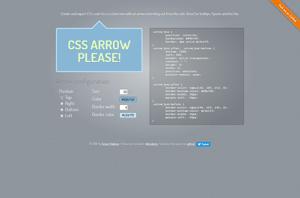
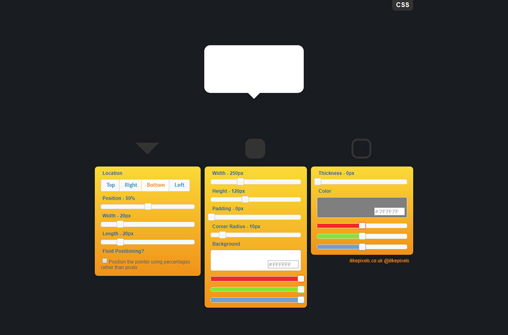
CSS Speech Bubble Generator CSS Arrow
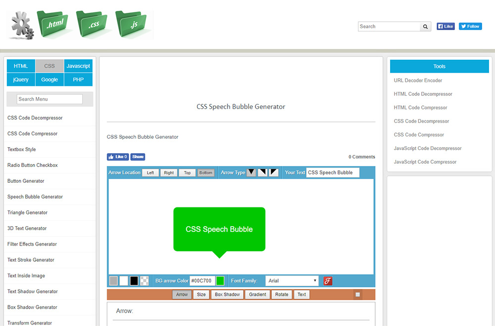
吹き出し向きと、グラデーション・影(シャドー)までカスタマイズできる吹き出しジェネレーター
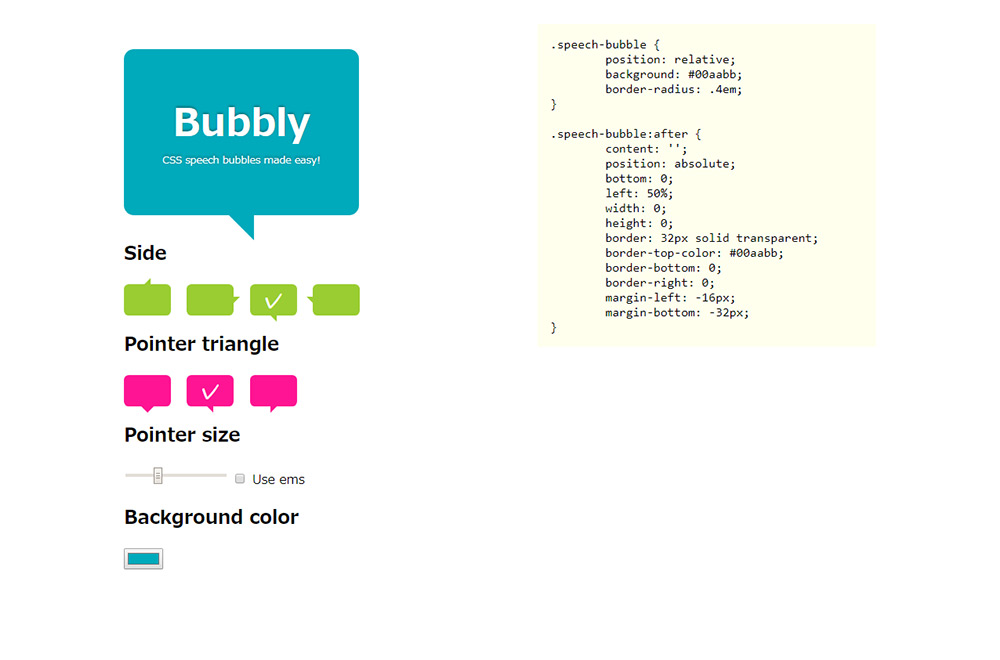
吹き出しデザインのアイデア
コードコミュニティサイトCodepenで公開しているCSSで作られた吹き出しのアイデアからデザイン例をピックアップしました。CSSでの吹き出しを作成する時の参考にしてみてください。
responsive speech bubble
レスポンシブ対応の丸みのあるCSS吹き出しのデザイン
See the Pen responsive speech bubble by peros (@perossing) on CodePen.
Comic Bubbles
円を重ね合わせた漫画でみられるCSS吹き出しのデザイン
See the Pen Comic Bubbles by Tiffany Rayside (@tmrDevelops) on CodePen.
Speech bubble
角度を変えた立体感のあるCSS吹き出しのデザイン
See the Pen Speech bubble by Ana Tudor (@thebabydino) on CodePen.
Responsive Comic Book Layout
漫画のコマ割りのようなレイアウト
See the Pen Responsive Comic Book Layout by Chris Smith (@chris22smith) on CodePen.
Alternating speech bubbles
直線的でスタイリッシュなCSS吹き出しのデザイン
See the Pen Alternating speech bubbles by Kevin Østerkilde (@Kosai106) on CodePen.
Speech Bubble Animation
吹き出しを重ねたアニメーション
See the Pen Speech Bubble Animation by Ali Klein (@AliKlein) on CodePen.
origami – speech bubble
折り紙を折ったようなCSS吹き出しのデザイン
See the Pen origami – speech bubble by Moorthy (@moorthy-g) on CodePen.